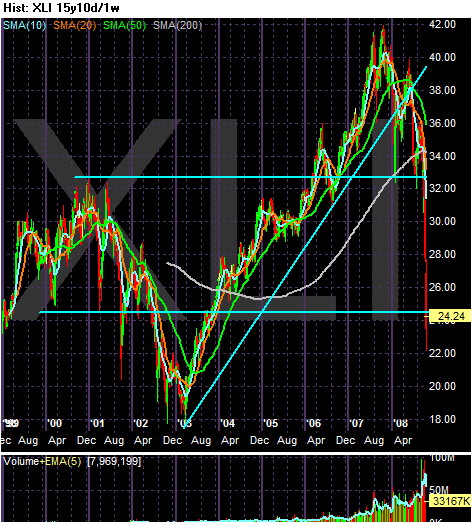
On the 15-year chart, note the chart is at levels from 2000. In other words, 8 years of gains have been wiped out. Also note the uptrend that started in 2003 was clearly broken.

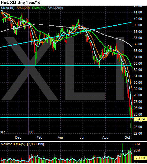
On the yearly chart, notice we're near yearly lows.

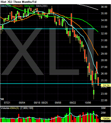
On the three month chart, note the following:
-- Prices are below all the SMAs
-- All the SMAs are moving lower
-- The shorter SMAs are below the longer SMAs
Bottom line: This is a very bearish chart.