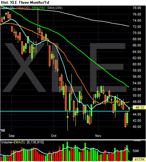
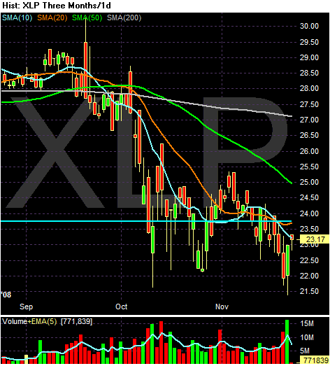
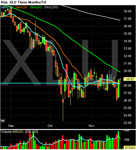
-- The XLE (energy) XLP (consumer staples) and XLU (utilities) all appear to be bottoming. Here are the charts:
All the other charts have the following characteristics:
-- All the SMAs are moving lower
-- The shorter SMAs are below the longer SMAs
-- Prices are below all the SMAs
In other words, the technical orientation of a majority of the ETFs involved is the most bearish possible.
I'm going to present the multi-year charts in the order to the largest percentage of the S&P 500 to the smallest percentage. That list can be found here.
So let's begin.
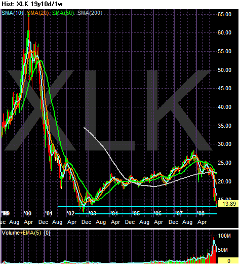
The technology sector has obviously never recovered from the tech crash of 2000. However notice that on the multi-year chart prices are near the lows attained in 2002. However, prices bounced off technical levels established in 2002. But most of the gains attained during the 2003-2007 rally are now gone.
Remember on the short term chart the orientation is still very bearish.
So -- we have a long-term technical level that is very important but a short-term bearish chart.
Fundamentally the news has been bad. Several big companies have announced lay-offs. Intel recently issued poor guidance for coming few quarters as well.
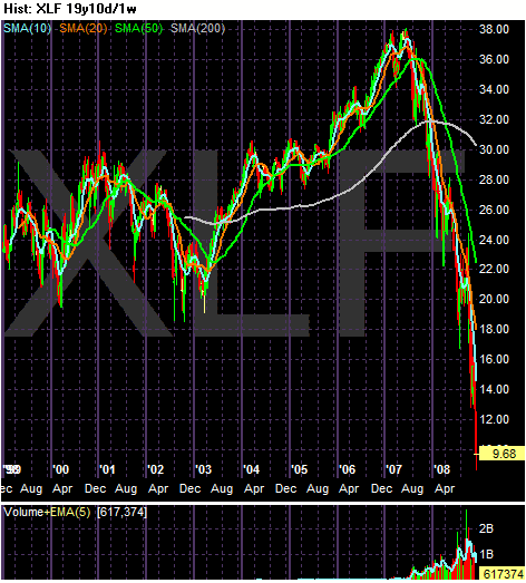
The financial sector is at multi-year lows. This sector is fundamentally a basket case. As mentioned above, its daily chart is still incredibly bearish. With the government having to come in and vail-out Citigroup today it should be obvious we're nowhere near a bottom in this sector.
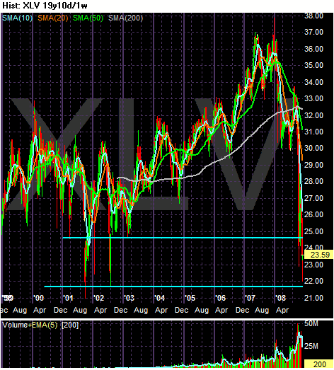
Although health care is supposed to be a safe haven it has been anything but that in the latest sell-off. Like other sectors, health care is trading at multi-year lows. Note the severity of the sell-off -- it was very harsh.
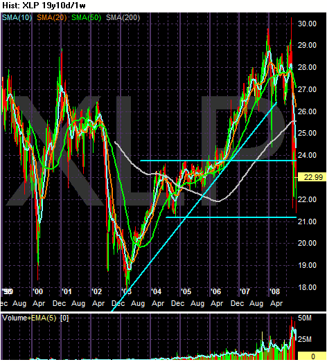
Although consumer staples have taken a hit and are clearly off their highs, they are still 29% above their 2003 lows. That makes this sector a winner for now.
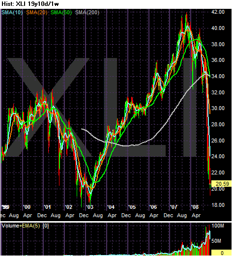
Industrials are about about 20% above their 2003 lows.
The bottom line is pretty clear: the vast majority of sectors are trading ay multi-year lows. Their daily charts predominantly bearish. The multi-yeare charts indicate a majority are at or near multi-year lows. Bottom line: it doesn't like we're at a bottom yet.